Everything started some months ago when my interests in analyzing better the data available of Jira increased, Jira has great dashboards, but those dashboards sometimes are hard to configure, there are many add-ons out there, but of course, you have to pay for them.
I started to check Jira API and step by step I developed my own tool called Visual Agile, the tool basically hits Jira API and then, builds some charts, where the goal of the charts is to increase transparency and visualize what is actually happening in the teams, so the teams become aware of what are they doing.
I think Visual Agile can give you a holistic view of the team.
What you are going to see is the first version of Visual Agile, my MVP where UX, the type of charts used and the grammar(being reviewed) can definitely improve.
Big Thanks here to my dear colleague John! who helped me a lot with the tool, giving me ideas so I don’t make nonsense charts 😉
Also Mac! you also helped with the tool and gave me good ideas!
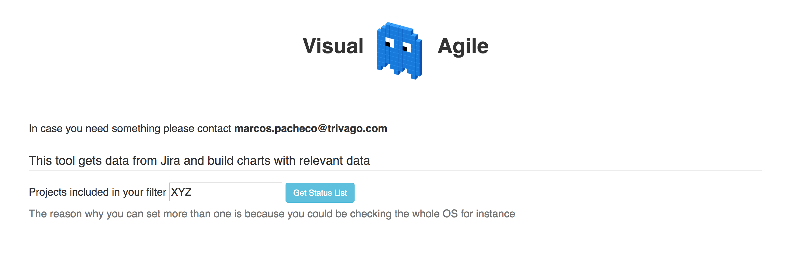
The first you have to do is to set your code or codes of the Jira projects you want to check, why? because I need to know the type of tasks and different status you use.
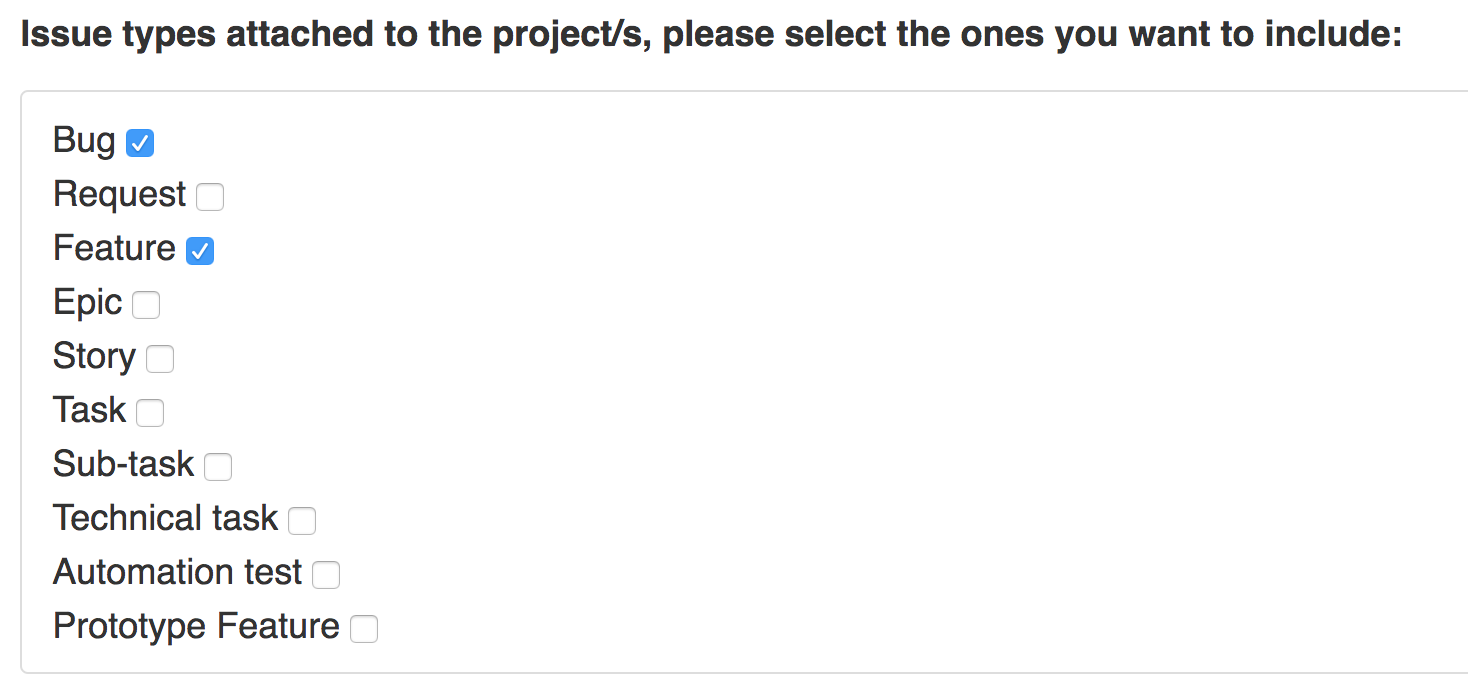
With the response, we will first decide which kind of type of tasks we want to include, the reason is that one of the charts I build is the efficiency flow, and you maybe just want to generate it for certain type of tasks.
Now, in order to generate all the charts, we need to know the meaning we give to the different status, I know that with a perfect defined workflow you might not need this, but it can happen that the same workflow is used for several teams, and the meaning of the status might change for one team to another.

As you can see we have different selectors, each selector contains all the status of all the workflows of the project, the reason is because in the same project you could have different type of tasks and each type of tasks could be attached to a different workflow.
All of this might be a little bit confusing, I know, the UX is not the best, the goal here is make it everything customizable so you can create any combination you want based on the meaning you give to the status, I will put you an example.
As you know Jira differentiate the different status in 3 colors, blue, yellow and green, to summarize in just a few words they mean the following:
- Blue: Backlog.
- Yellow: In Progress.
- Green: Done.
In one of the workflows I use, there is one status called “QA: Passed“, the meaning is self-explanatory, the problem here is that within Jira this status is Yellow, and for several teams this status means that the task it’s finished and only pending to be released, so if the team in the middle of the sprint wants to see how many finished tasks they have then Jira could not show it properly with a Dashboard because the status is Yellow, not Green.
You could argue that we could just adjust the workflow, but trust me in a big organization is not that easy, that is why with Visual Agile I’m giving you the chance to give that meaning to “QA: Passed“, I hope you understand what I mean.
Once you have selected all the statuses now we need to provide the JQL, or either you save it in a filter or you just copy paste the JQL.

Now we have two options here:
- Sprints
- As you can see in the picture you can just add the filter there, this will return a list of tasks, all the tasks that contains each sprint, and each sprint has a start and end date.
- Kanban
- With Kanban you don’t have sprints, but you might be interested in checking periods, for example, if your filter returns tasks from January 2017 to December 2017, you might be interested in checking monthly periods to see how has been evoluting.
If you check Sprints then you don’t need to set any dates as Visual Agile will use the start and end date of the sprints, if you analyze something else then you need to specify periods.
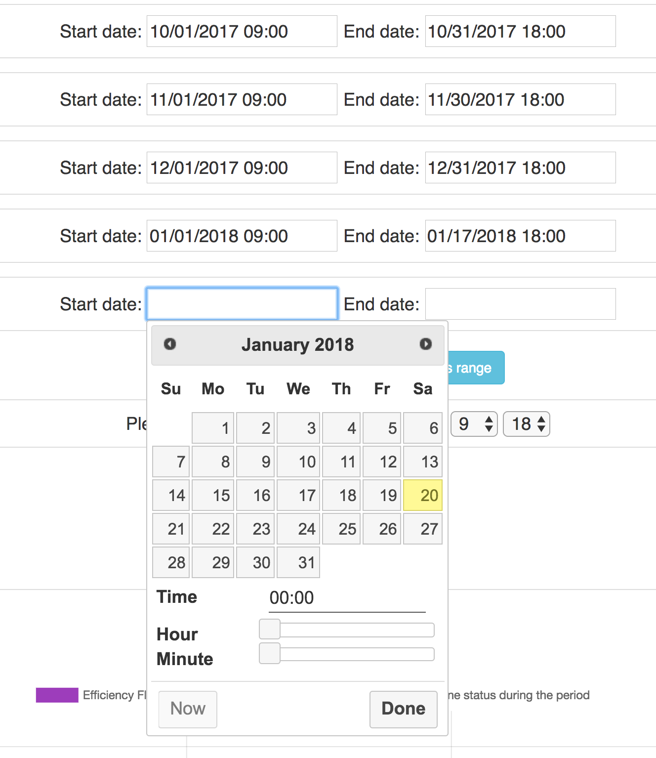
Now the last thing to set is your working hours, some of the charts contain time, therefore we want to make sure that we don’t include weekends or nights, so Visual Agile give you the chance to specify your working hours range.
![]()
Outcome
For every task I know all status transitions, what I do then is to calculate the time difference of when the change to each status started and when the change to a different status also started, of course, the time difference is taking into account the working hours range and excluding weekends.
Efficiency Flow
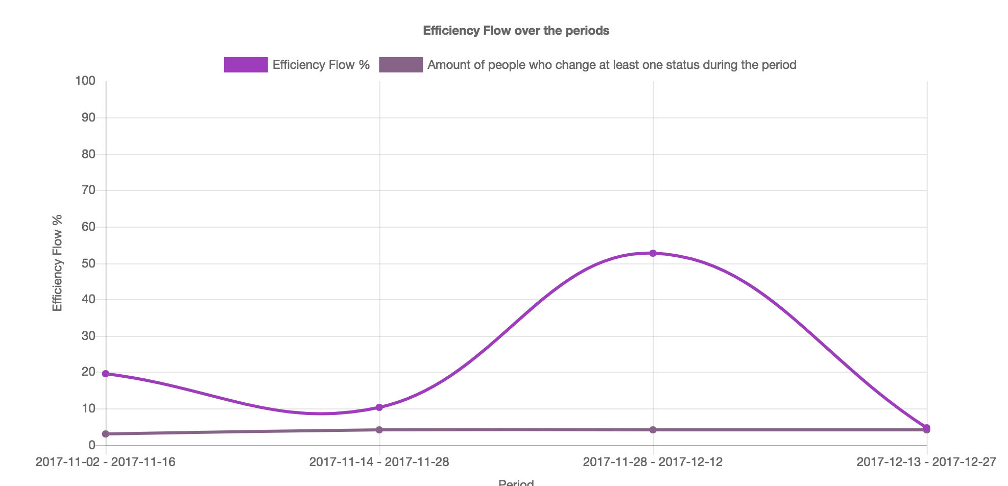
The efficiency flow chart gets the time spent in Work In Progress statuses and None Working Progress statuses, then with a formula, I end up having the % of efficiency flow.
The other line reflects how many different people at least changed on status during the period, this could explain maybe why in a certain period the efficiency flow increased or decreased, is basically reflecting how many people approximately have been working during the period.
Cycle Time & Lead Time
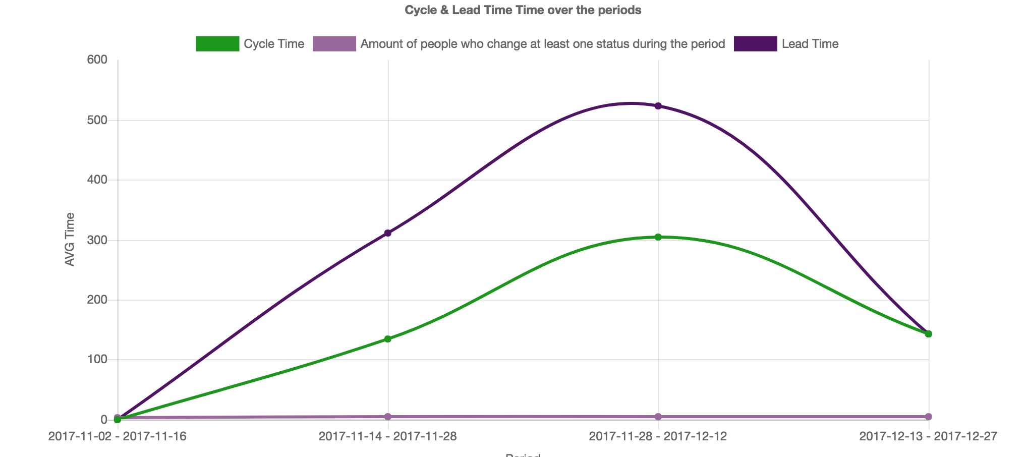
As you also have to select the Cycle Time and Lead Time statuses, what I do is to get the average of all “Finished” tasks for each period, so with this, we can see if the tasks we finish they have been for a long time in the backlog for instance.
With the chart, we see that in the third period many of the tasks that were closed were in the backlog for a long time, but the opposite happened in the last period, where seems like that the tasks that were closed did not stay too much time in the backlog.
Tasks added after the sprint started
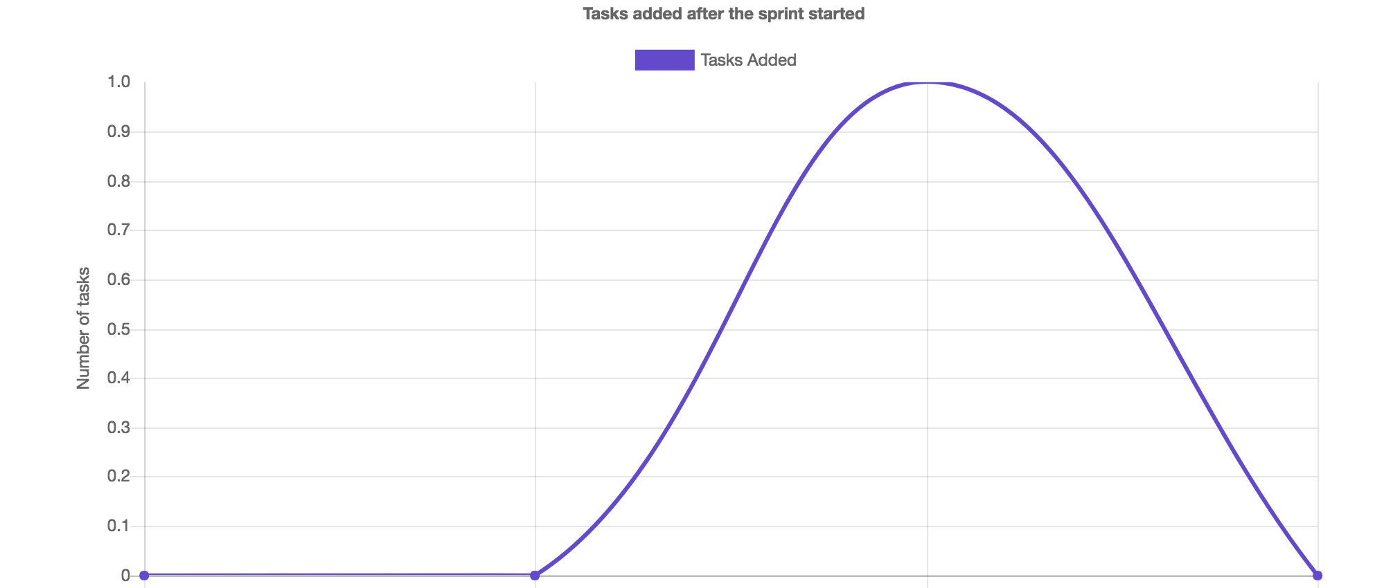
Quite easy to understand, we can see how in the third period we included 1 task after the sprint started.
Comparison tasks finished

This one is quite interesting, the blue line indicates how many tasks were finished in each period, where the orange one tells us how many of those tasks were stopped, blocked or stuck in the flow once they were started, the black one reflects how many went straight forward through the system, I also say they went “clean” so not waste generated.
This could tell us if the team is having too much context switching, or problems with the tasks once they start working on them, basically as close is the black line to the blue line then the better.
Reopens
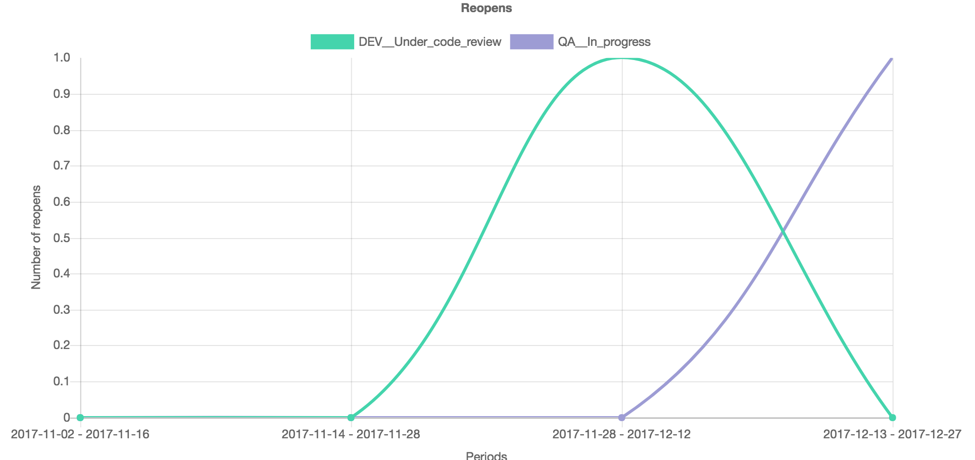
This workflow, in particular, allows you to reopen a task during a code review or during the QA process, this chart basically visualize how many reopens the team had during the periods, where we see that in this case in the third period one task was reopened during the code review process, and during the last period one was reopened from QA.
With this, we could see maybe if the team is rushing too much, or maybe, if the reopens from QA start increasing but not from code reviews it could mean that maybe the team should put more effort when is code reviewing the task?
Time In Status
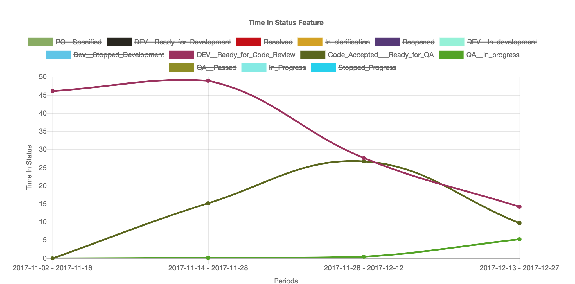
For each type of tasks we can also see this, how much time in avg was spent in each status during the period, I will explain you the meaning of this because is quite interesting.
As you can see 2 of the status that I’m showing are queues, ready for code review and ready for QA, we could argue if they should be statuses or not, but the fact is that they are and I’m sure that many workflows out there also contain similar status.
We can see how in this case during the lasts periods the time spent waiting for QA decreased, and also the time spent waiting for code reviews.
The light green line is the time spent testing something, is interesting to see how it takes always longer to start testing something than to actually the time spent testing.
With this graph, we could ask the team what does this tell them, we could guide them to discover by themselves that it might be a bottleneck an then challenge them how they could improve the process.
Top Tasks Waiting and Working
Is nice to see the averages, but they have a problem which is that you could be missing problematic tasks, extremes are not good, this is why with this chart I’m showing the top tasks with the most time spent in “working” statuses, and the top time spend in “waiting” statuses, with this information we could spot problematic tasks.
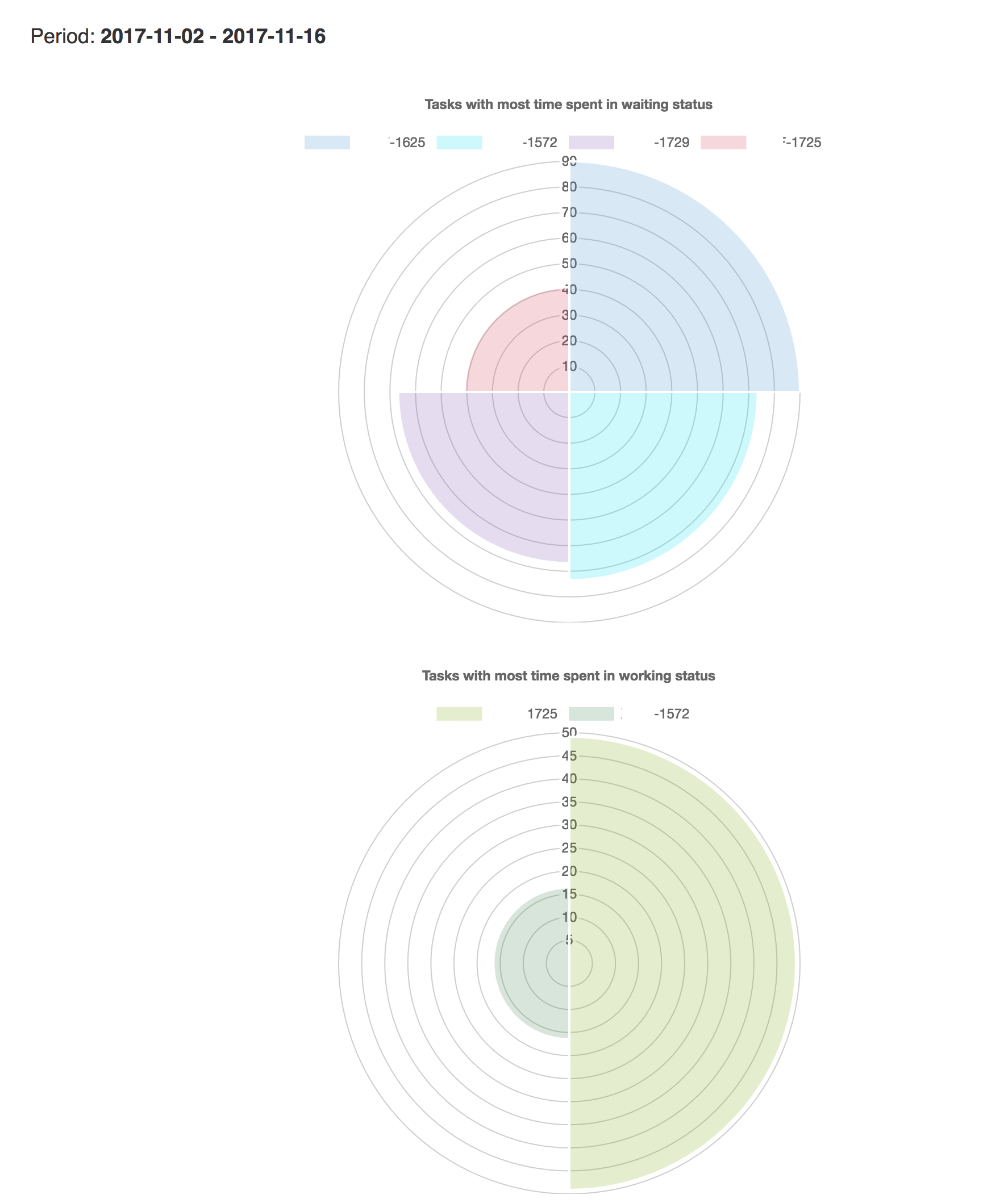
For example, we see how the task 1625 was for a long time in working statuses, after checking the task what I saw was that almost 100% of the sprint the task was waiting to be code reviewed.
Final
Don’t get Visual Agile as a controlling tool, because that’s not the purpose at all! My goal is to help the teams to see how are they doing, to give them a holistic view, they might be missing improvement opportunities, or suffering from bottlenecks and with this, I’m just being transparent, getting available and public information for everyone and visualizing it in different charts.
For me is very imporant to say that this tool is available for everyone, for Product Owners, Developers, etc, whoever wants to see how is going, this tool is not to blame anyone for anything, this tool is for helping the teams to reflect on where we the current problems, so they can find improvement opportunities.
Of course the tool is In Progress, this is only the MVP and more updates are to come!