Influenced by Agile Decision Making with Marius de Beer
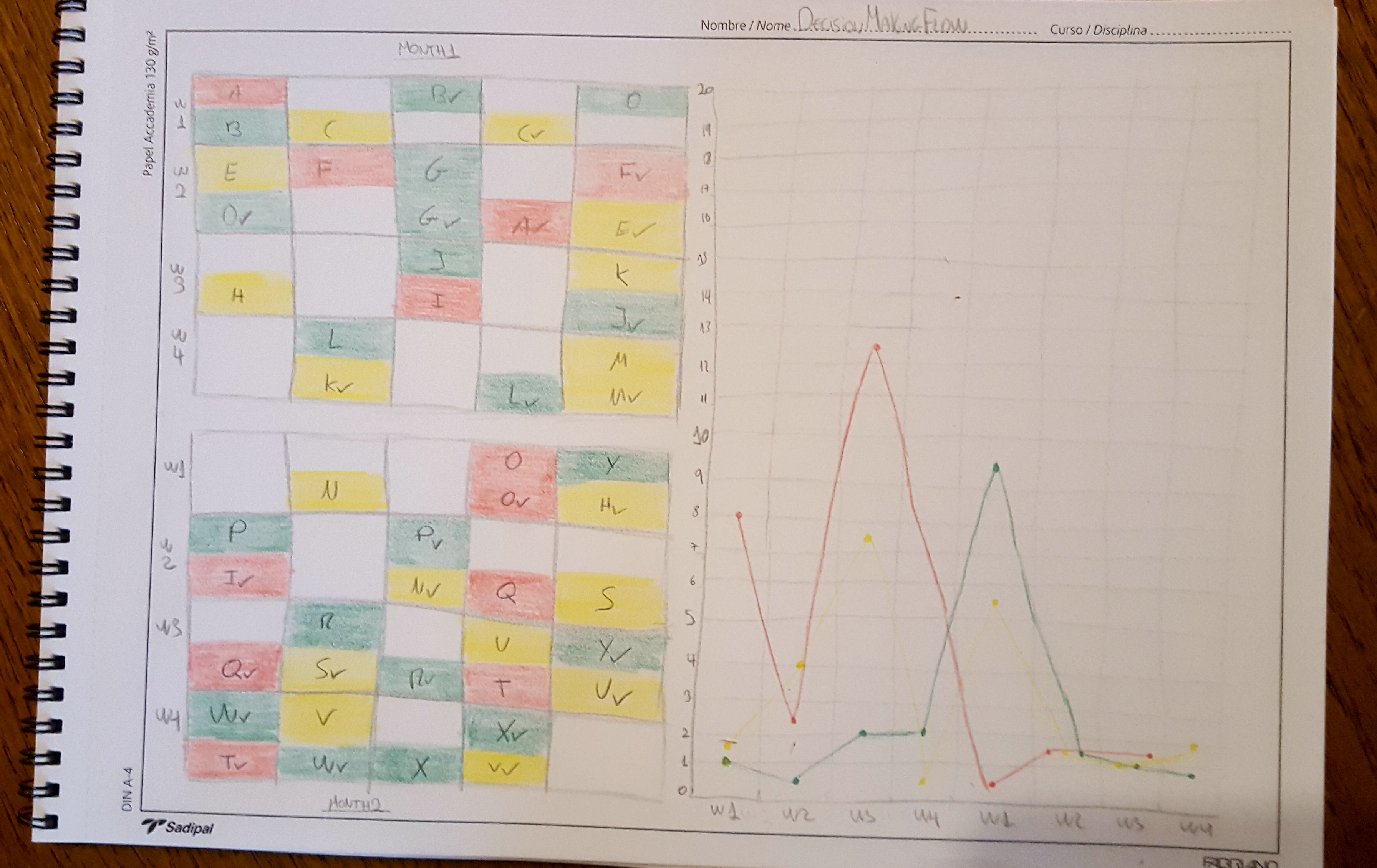
I came up with this simulation of #DecisionMaking visualization, basically I’m trying to see and be more transparent with how is affecting the teams the way of making decisions. Every day we have to move forward our stuff right? and the team we work might not be able to take certain decisions or to execute certain actions, for example: If I need access to a server I will most likely have to ask someone in the infrastructure team to give me access, this does not mean is bad, this just means we have to wait for someone to move forward.
You see 3 colors, green means that the team itself owns the solution, that they do not need anyone or anything to move forward with what they need. Yellow means someone which is not in our team has to do something for us. Red means someone in mngmt needs to do it.
Each letter of the alphabet represents our request, need, decision, etc…
If you start tracking how many days your team is waiting for stuff you could end up having a nice chart that you could use to improve teams collaboration and expecations… what do you think?
If you see over the weeks how any of the colors increases this would mean that there is room for improvment in your #DecisionMaking process.